Mango Health
UX design; Visual Design · Winter 2019
Overview
Redesigning Mango Health to help people regulate their medication
Note: Done for the KP fellows application, I am in no way affiliated with Mango Health.
Role
Solo designer and researcher
Project Timeline
2 weeks in January 2019
Team
Chaitanya Prashant - Designer and researcher
Responsibilities
User research, interaction design, visual design.
Introduction
For my application to the KP Fellows program, the prompt seemed simple enough, yet represented an interesting challenge.
Redesign a feature of a KP Portfolio Product
Going through KP’s impressive portfolio, I imagined daring product additions to unicorns like Airbnb and Uber, or captivating redesigns of a personal favorite, Spotify. However, I eventually settled on Mango Health.
Mango Health aims to solve a pressing problem within the healthcare space, which is to help people manage their medications and form healthier habits.
Mango Health, while humbler than some of the massive companies on the list, piqued my interest because of its mission to help people regulate their medication and live healthier lives. Some of my family members use similar apps, and it represented a pick where I didn’t know too much about the app coming in, but knew of the basic use cases.
Disclaimer: This redesign was done without access to actual user data or user feedback from Mango Health. These would be critical considerations in a real-world project. In order to account for this, I conducted my own secondary and primary research, which gave me a reasonable foundation for the project.
Who are the users?
Mango Health’s user base exists across a variety of demographics, and after conducting testing and reading up more about who uses Mango Health, I came up with three personas to fit the different demographics that are the most represented for the product. I will be presenting the story of my redesign through the lens of these three users
Joy

20 year old college student
Still getting used to the idea of taking regular medication, but isn’t as serious as she should be.
Has an unforgiving schedule and wants to be able to see what she needs to take quickly.
Wants to establish healthy lifestyle habits.
<Prachetan

Middle aged, working parent
Likes getting reminders about medication on the go.
Journals his mood and eating habits to adopt a healthier perspective on life.
Susan

Retired architect
Is forgetful about what pills she has to take and when.
Gets frustrated by her reminders app very easily.
What's the problem?
Whenever I do a redesign, I aim to look at pressing, people problems to solve rather than cosmetic redesigns that don’t add tangible value.
Therefore, the first thing I did while auditing the Mango Health app was ask people (friends and family), both who have used Mango Health and new users alike, their thoughts on the app. This is to ensure that I’m not stuck in my own bubble of perspectives, but consider other people’s needs and pain points.
Some of the questions I asked included,
- How often do you use Mango Health?
- Is the app successful in helping your track your medication?
- What features of the app do you use the most?
- Do you struggle with any of the app’s features? What would you change?
I also conducted some short usability tests on their overall experience of using the app itself, which would help me gather design opportunities and user pain points.
After analyzing these results, as well as personally auditing the current design, I compiled a list of some of the potential design opportunities and critical user pain points within Mango Health.
Visual design and heirarchy
A common pain point while conducting usability testing of the application centered around the visual design, and it does little to aid usability.
The user needs to put in a lot of work and consume too much information in order to scan through the homepage. While the use of cards is a common visual pattern in interface design, they all seem to be fighting for attention rather than guide the user in terms of the actions they should take. Does tapping on a card take them to a particular topic? This was a question that was asked a lot during usability testing first up, and a critical problem seemed to be ambiguity for actions.
Similar concerns arise for the inbox tab, which is used for general information about different medications. While it serves as a central hub for this information, the unformatted descriptions and unclear hierarchy here can confuse the user as to what the information truly means.
Lack of personalized indication when adding medication
A behavioral pattern I noticed was that patients usually refer to their medications by their indications, such as “Time to take my blood pressure meds!” However, when a user takes a medication, the app simply says “Dose recorded”.
By personalizing the patient’s medication information and accompanying messages, however, we can increase both motivation and adherence through the principle of positive reinforcement.
Task Completion
In the current flow for completing a day’s tasks, a user has to move between four different screens before their task is recorded. In this example, users must first click on their reminder under “My Schedule”, after which they are forwarded to a list of the next week. From there, users are forwarded to the landing page for the habit/medicine selected. Finally, they click “Record Now”, for the reminder to be logged.
This flow takes multiple steps for an action that should, in essence be simple and persistent. For all three of our users, this presents a definitive problem, as completing a task becomes an arduous process, rather than one which is gratifying and motivating.
Schedule
Currently, even if a user has multiple reminders throughout the day, only the upcoming reminder shows up on the screen. While feeling restrictive, it could also be detrimental to users who might not turn on notifications or only check the app periodically.
Lack of context when taking medication
For our users who might be new to taking medication on a regular basis, this is a major pain point, as some medication have interactions that they might not always be aware of. This is especially true for Joy and Susan’s use case.
Currently, a user would have to go to the inbox or click on the specific medication to find out more about the medication’s common interactions.
Learning more about specific medications
To currently learn about a specific medication, one has to either go to the inbox (which has unformatted information galore), or the specific medication, where the detail tab only shows the instructions for the medication. To learn about its interactions however, the user goes to the alerts section, where the information is unformatted and is simply a link to another page. For a user who wants to quickly learn about a specific medication, this can serve as a hindrance to their experience.
Solution
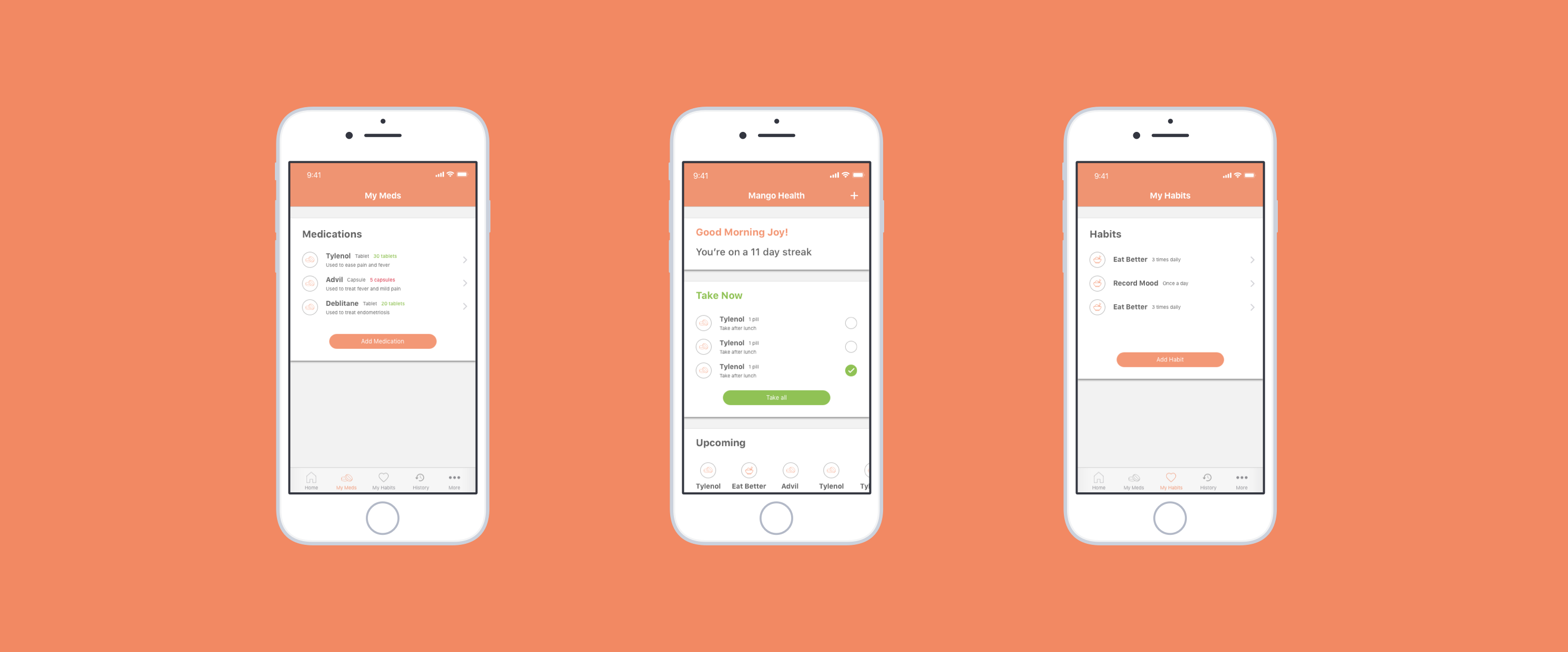
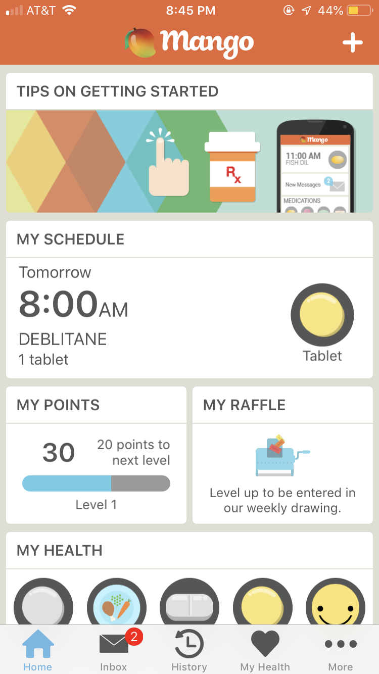
Homepage
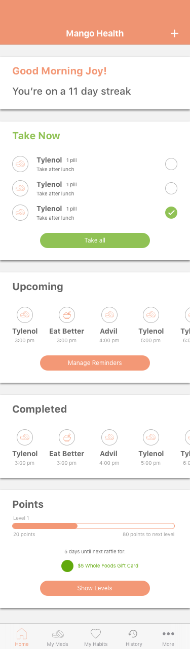
Redesigned home page
In the redesigned homepage, I maintain the main call to action, which is to add a medicine, habit or care recipient at the top of the nav-bar, much like the previous design, as it follows iOS design patterns and is clear to the user.
I employ a card based approach, but instead of pushing cards that are fighting for attention, I decided to dedicate each card to take the full width of a screen, with larger headers emphasizing both visual consistency and clarity.
I surface Mango Health’s streak based information first up, as Mango Health’s original value proposition is to “gamify” healthcare, and this sort of positive reinforcement aims to motivate the user to adhere to their schedule!
For reminders and medicines currently on the user’s schedule to take immediately, I surface that information in the “Take Now” card, which aims to motivate the user to record their medication with a simple, yet familiar interaction of marking the checkbox. Each reminder is equipped with dosage information and medication notes, important contextual information that is especially important for users who might forget dangerous interactions or specific instructions about the medication.
Upcoming tasks are surfaced horizontally for the user to clearly view what the user has up next, including what time it’s coming up, so that the user has a clear idea about their schedule at a glance. A call to action to manage reminders is available from the homepage if the user wants to manage and edit specific reminders
Similarly, points are surfaced with a clear measure of progress, as well as added information for Mango Health’s raffle feature, which can act as another motivating factor for the user to adhere to their schedule!
Adding a new medication
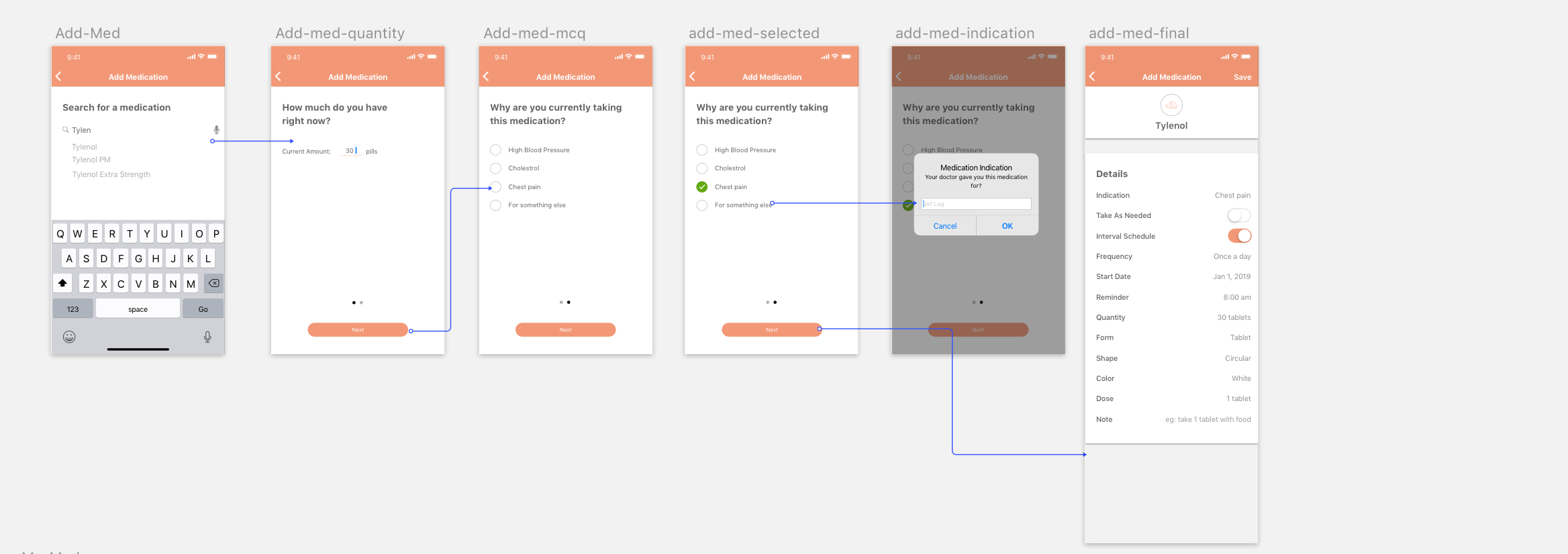
Interaction flow for adding a medication
While Mango Health’s current flow for adding a medication is fairly easy, one aspect it lacks is personalization to each patient’s specific case. As mentioned in previous research, some patients don’t know why there are taking their meds. Although there is a note field for the added medication, is it ideal?
Personalizing the patient’s medical information increases patient motivation by letting them be mindful of exactly why they might be taking a particular medication, which in turn would help their adherence.
Separating My Health into My Meds and My Habits
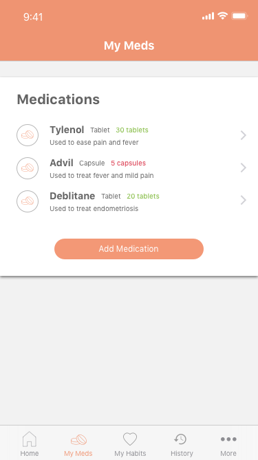
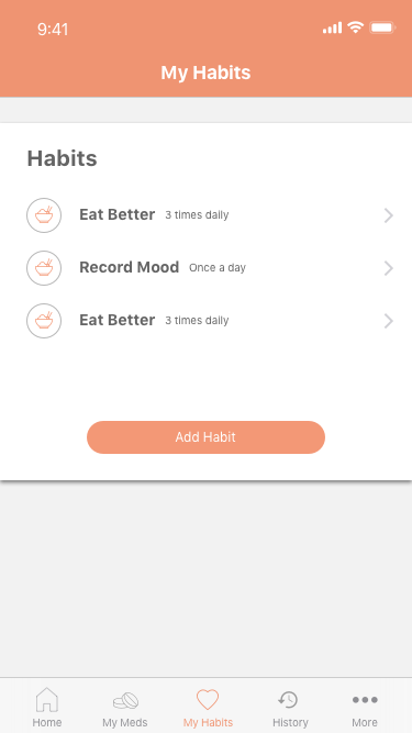
Separated screens for a user's medication and habits.
The decision for the split was mainly due to habits and medications being inherently different things. While medications require specific dosage information, and have a set of instructions, habits are a much more personal recording experience for the user, where they keep a log of their habits and can chart progress and continue to become healthier individuals. This is opposed to medication, where we are simply measuring adherence in this case.
Inherent difference aside, it is especially important on mobile interfaces that we are fostering focus, especially in the case of Joy and Susan.
Specific Medication
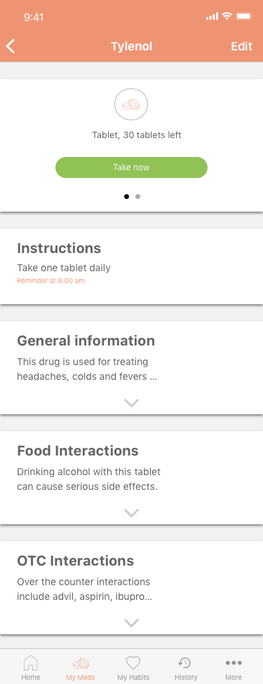
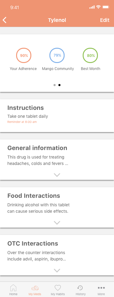
Specific medication page with physical information and adherence metrics.
I adopt a similar card based approach to specific medications as well, with the top card showcasing a clear call to action to take now, or edit your reminder on the nav bar. A swipe to the right showcases adherence metrics in an easy to compare, yet visual manner which aims to keep the user motivated about their meds
A clear instructions card provides the user with dosage information as well as when their reminder is set in an easy to access way.
Inbox specific information, which was unformatted and linked to different pages, are now specific cards as well, offering contextual information to the user about the drug, and if the user wants to find out more, they can tap on the dropdown to reveal more detailed information.
Consolidating drug based information into a central hub, creates a more persistent way for users to interact with a specific medication and learn more about it, with the different kinds of information clearly defined and easy to find.
Visual Design
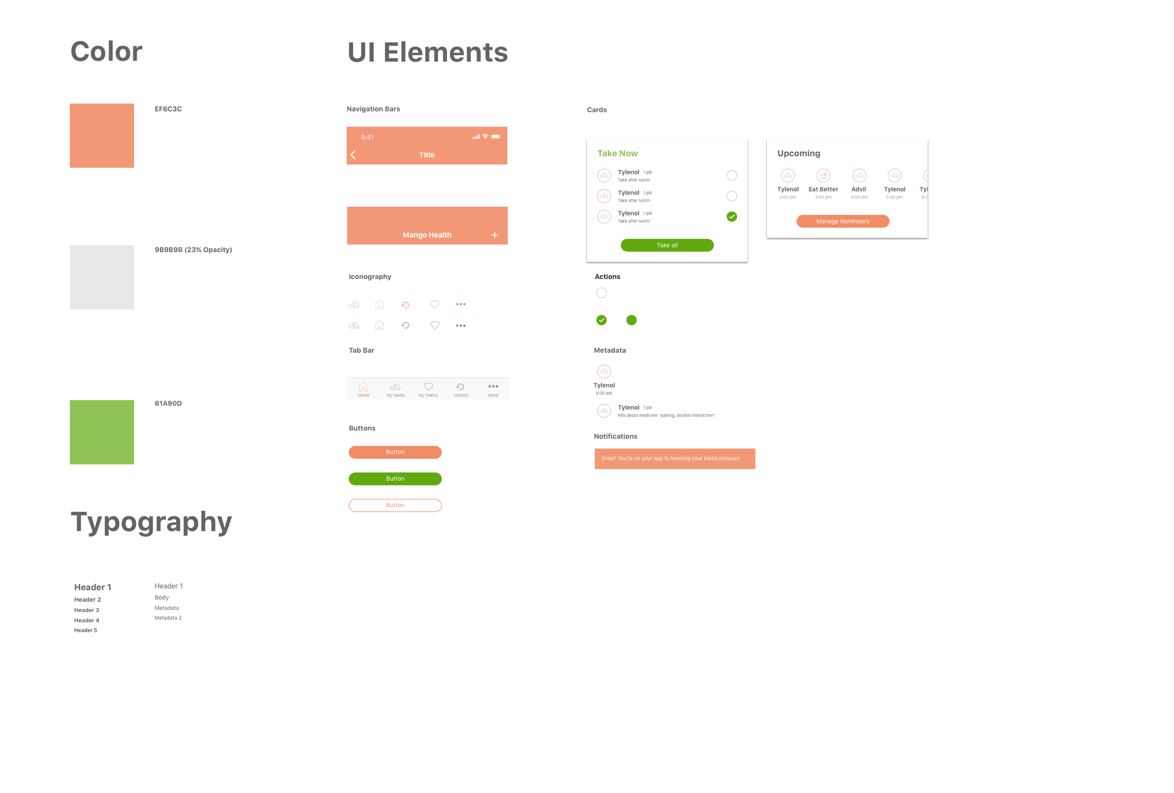
Final visual styleguide
In terms of the overall visual design direction, I aimed to keep it consistent and minimal, as our target user group needs information surfaced in a way that is clear and doesn’t provide cognitive overload for the user, which was a common issue in the current design of the app.
In terms of the current design of Mango Health, there were a lot of inconsistencies where font sizes, formatting, and visual spacing were concerned. Therefore, I used a concise visual styleguide, alongside an 8pt grid which aided visual consistency. A constraint I placed on myself was to not stray away from Mango Health’s branding. As an established company, I was wary of making any changes to brand assets and the logo, instead aiming to incorporate it in a simplified manner
Final thoughts
- Constraints matter: For my redesign, I wanted to stay true to the Venmo brand, and make sure to not introduce any new features or visual patterns that would be blue sky solutions to user problems and unfeasible. Instead, by focusing on interaction and product design, I was able to scope the problem space much better, which allowed me to come up with a stronger design solution.
- Mango health is onto something: While designing, it is often easy for us to design in a silo, which is why it is critical to get out of your own bubble and consider users’ needs and pain points before redesigning an existing product or proposing a new feature.
- There's no substitute for teamwork: I would have loved to collaborate with Venmo designers, engineers and users to deeply understand the potential tradeoffs involved. A lot of my designs were based on cursory research and designer assumption, rather than solid data, which would have been fantastic to leverage for this exercise, and would have surely lead to a stronger solution.
- Embrace the uncertain: To be honest, I am usually very apprehensive about redesigning an existing product that is already successful, because I might be stepping over previous decisions made by designers backed with data. Therefore, the best I could do to make up for the lack of data was conduct primary and secondary research that would give me a good foundation for the project.
Thank you for reading through all of that! If you have any feedback, don't hesitate to hit me up on chaitanyaprashant@gmail.com